User Interface × User Experience × WordPress
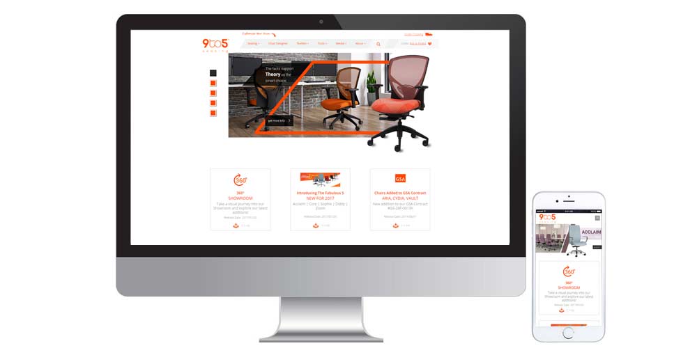
9to5 Seating: Phase I
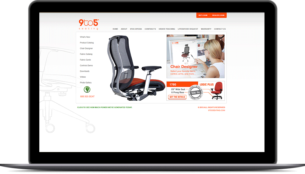
In the summer of 2016, I was hired by Creative Director, Mark Regynski, at 9to5 Seating to help assist in recreating and collaborating ideas to come up with a Hybrid Application that allowed Sales Representatives and B2B Clients an easy access point to display a wide-range catalog of seating products and customization.
Problem:
9to5 Seating was extremely out-of-date to their online marketing and technology. They desperately needed a redesign of the website but also needed a quick way to show potential businesses their online catalog and turn them into potential leads.
Solution Approach:
Create a Hybrid System that would act as a company website but can also be a resource that sales reps and clients can rely on when selling or buying from our line of office seating.
The Process
To begin the process, I needed to start out by doing some user research. Organizing the content hierarchy would be a very important key to how the website would be set up and how easy it can be to navigate the site whether our sales reps were using it, or new users who were to visit our new site.
User Personas
Mike Heazlett
Age: 58
Profession: Executive Sales Director at 9to5 Seating
Needs: Technology System to help B2B Clients visually see seating catalog and a home for resources for contacts and artwork.
Jorge Alverez
Age:32
Profession: Creative Agency Owner
Needs: Online Catalog to shop for new office seating. Some of his challenges is that he is very busy and needs a quick efficient way to shop for products online.
Jerick Sevilla
Age: 34
Profession: Regional Vice President at Sequoia Innovations
Needs:Physical and Online Product catalog to shop for new office seating. Busy but is open to viewing seats in a live showcase.
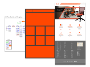
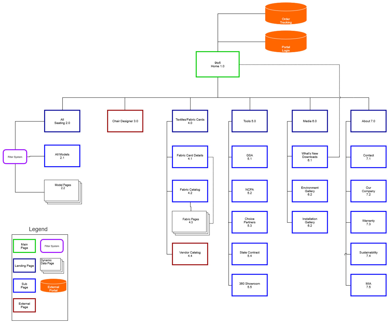
Site Map
The next big item on the list was the new chair designer that we were working on designing. We didn’t want to totally commit the user to click on the Chair Designer first and leave the new website. Our main goal was to give visitors the best experience possible first before steering them away into another application.
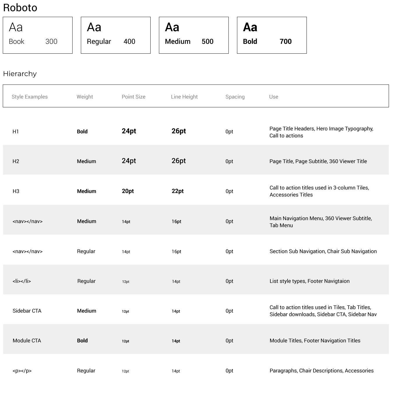
UI Kit
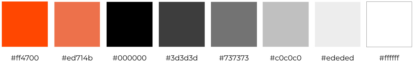
Color Scheme
Typography
Wireframes
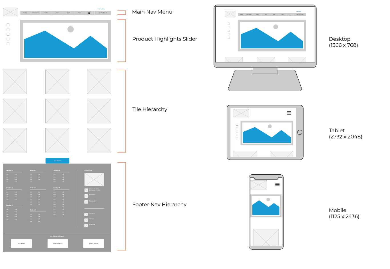
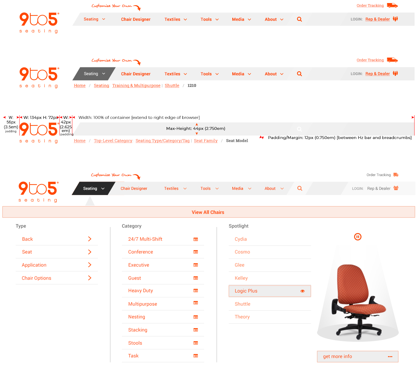
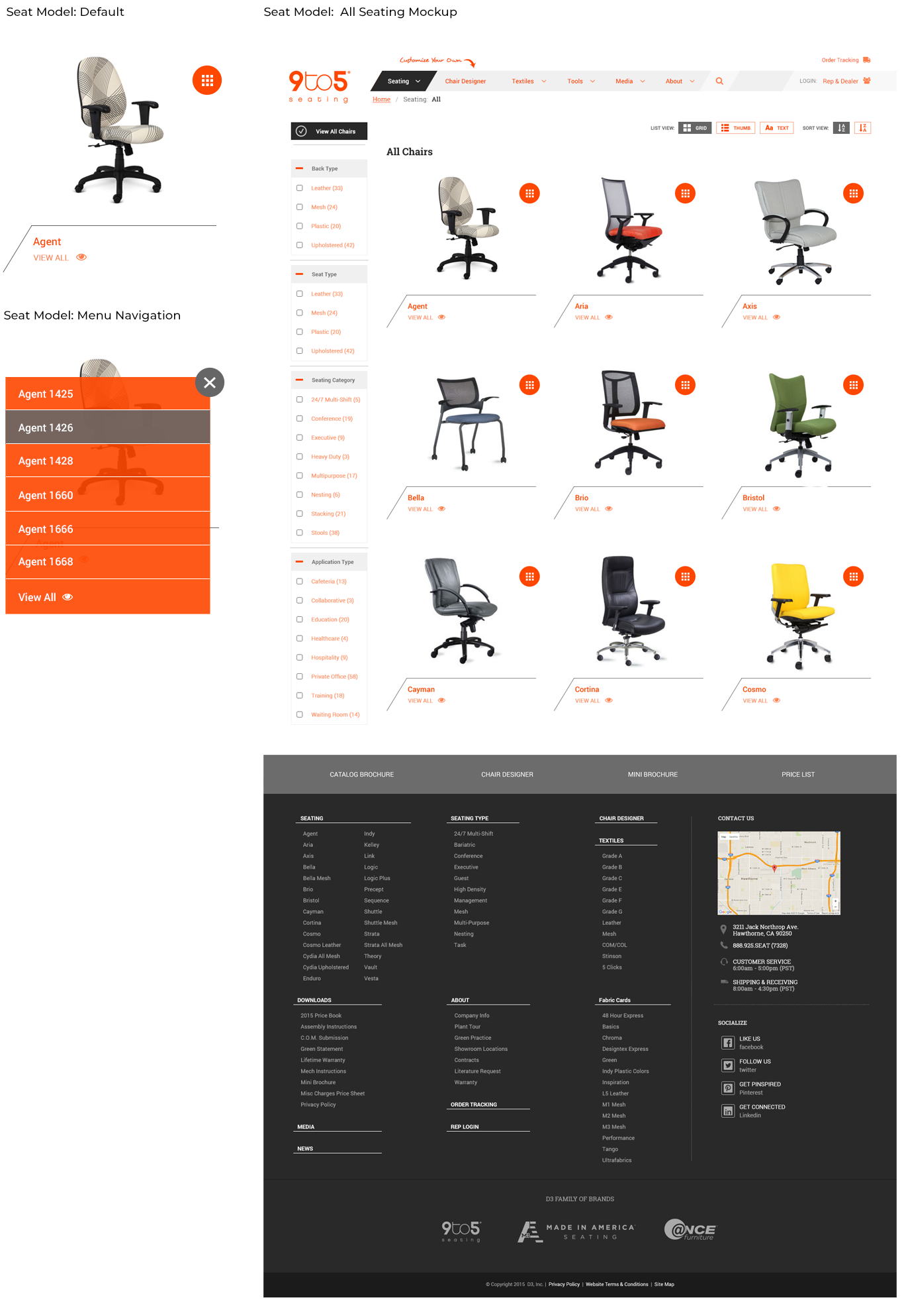
Main Navigation
One of the biggest concerns we had was that we put together a navigation comfortable and easy for our clients and sales reps to navigate through. According to the hierarchy that we built, we wanted the most important features visible first, highlighting what our clients are initially coming and browsing on the site.
The navigation will consist of a hover state that will give a dropdown that will highlight each selected url button. For example if they are hovering over the seating category, we will give the a sub navigation with the option of Type, Category (Category for the purpose of the chair), and a spotlight of some of the recommended seats.
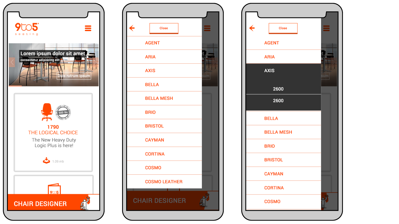
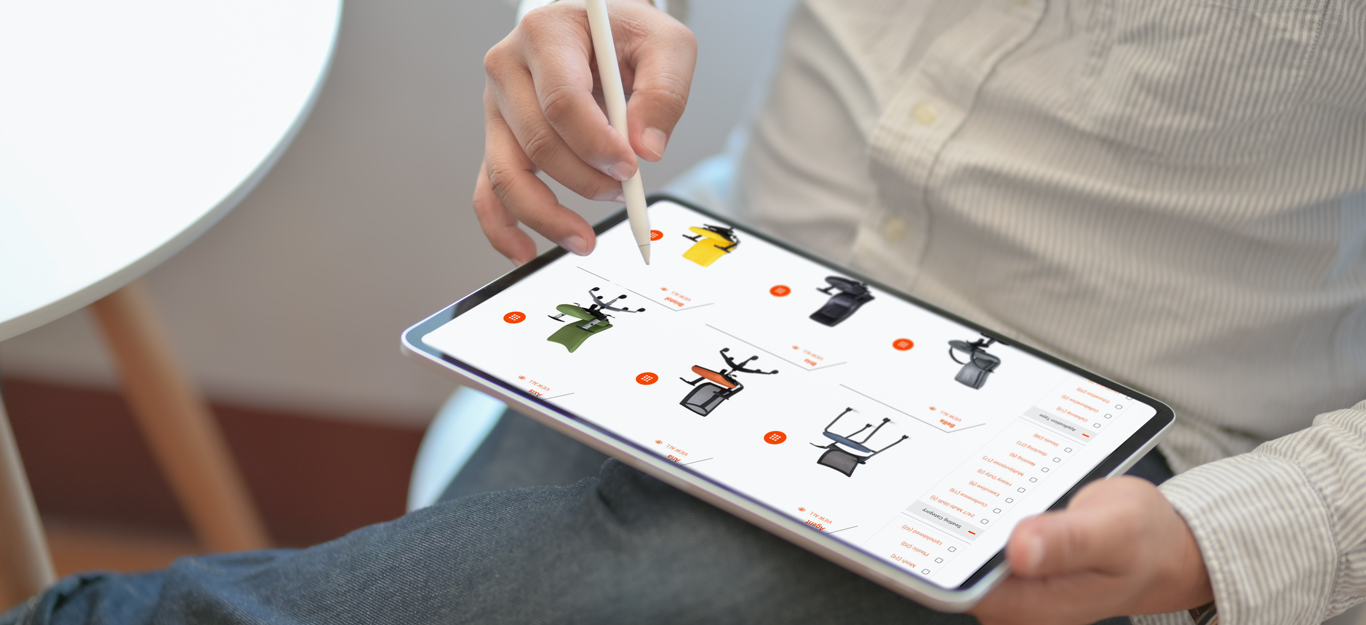
Just like the above the mobile version will also carry those different options but in a more compact design. The user will take some additional steps but they will still have full control of where they want to navigate.
HERO Sliders
Homepage Tiles
Homepage Mockup
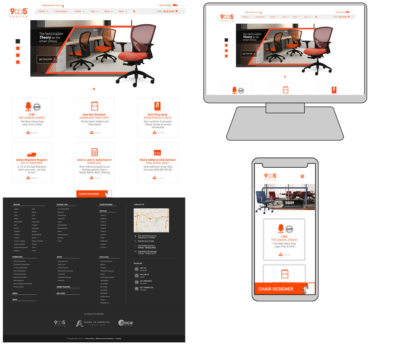
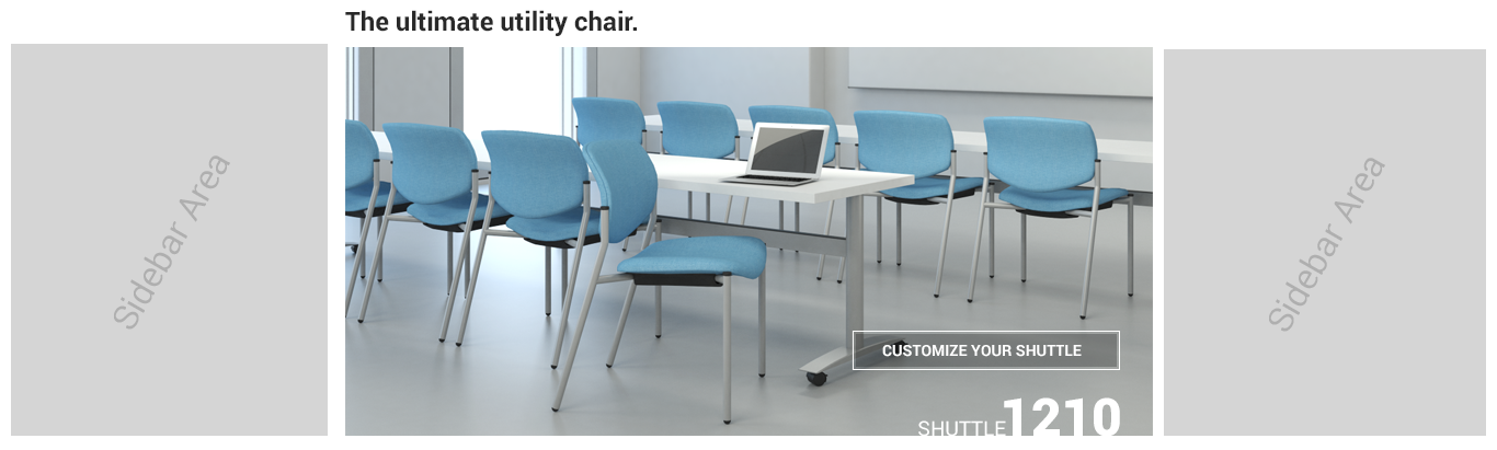
Sidebars
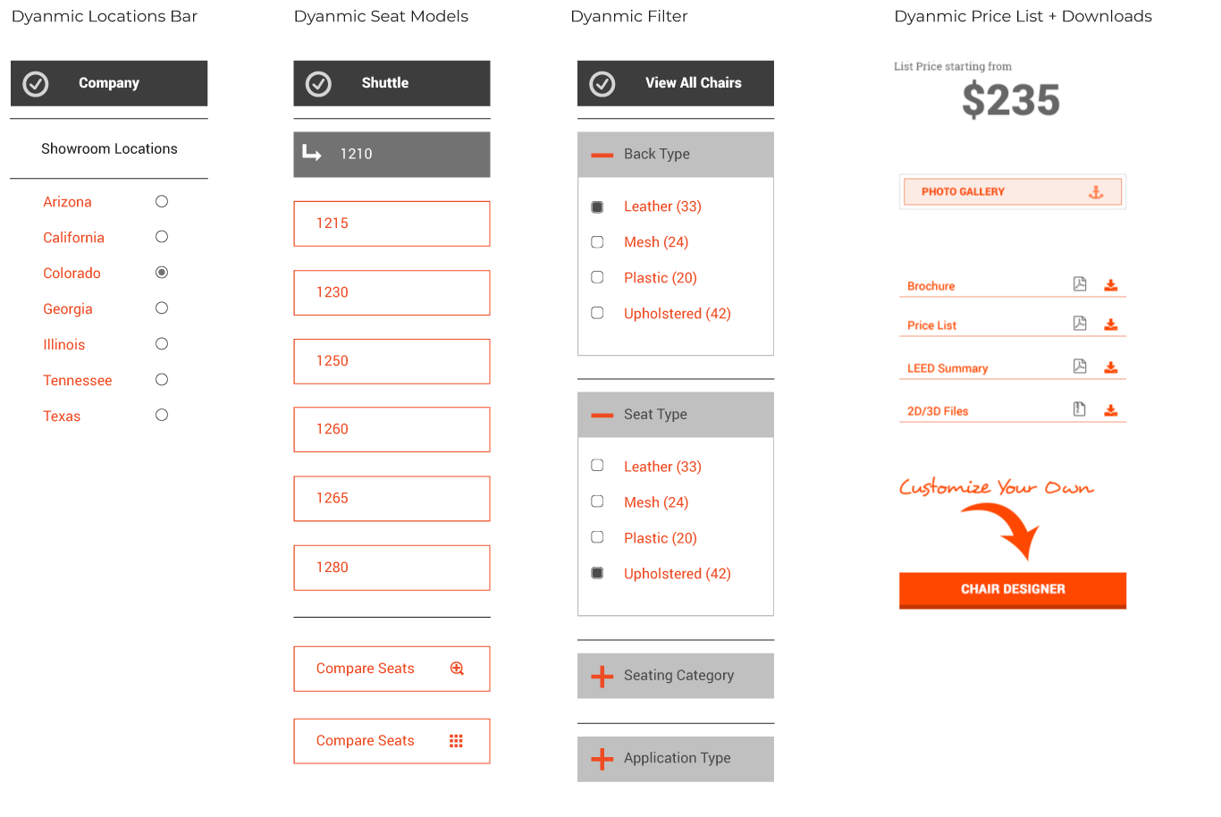
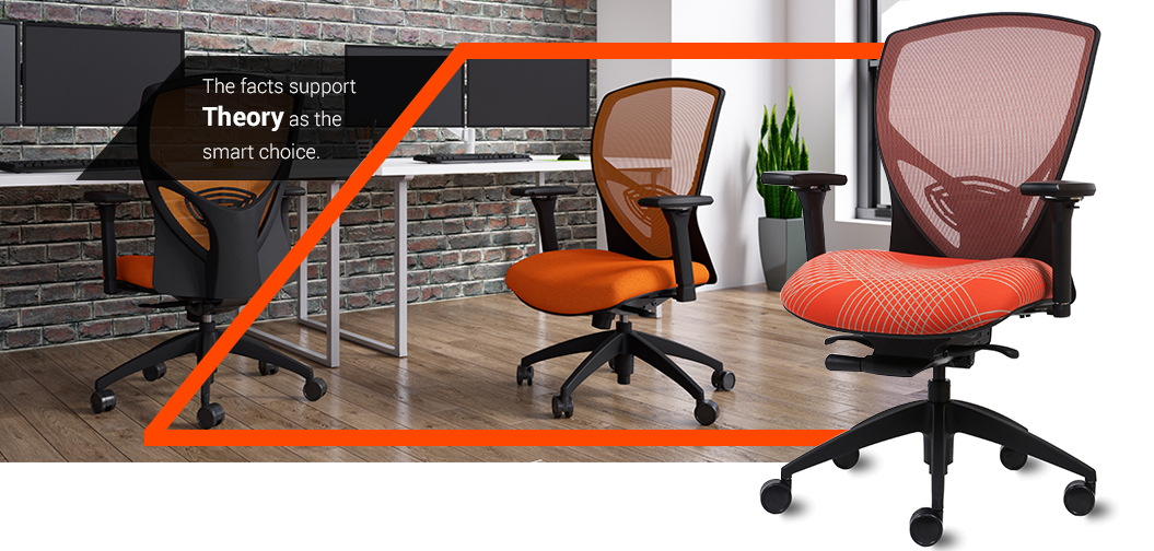
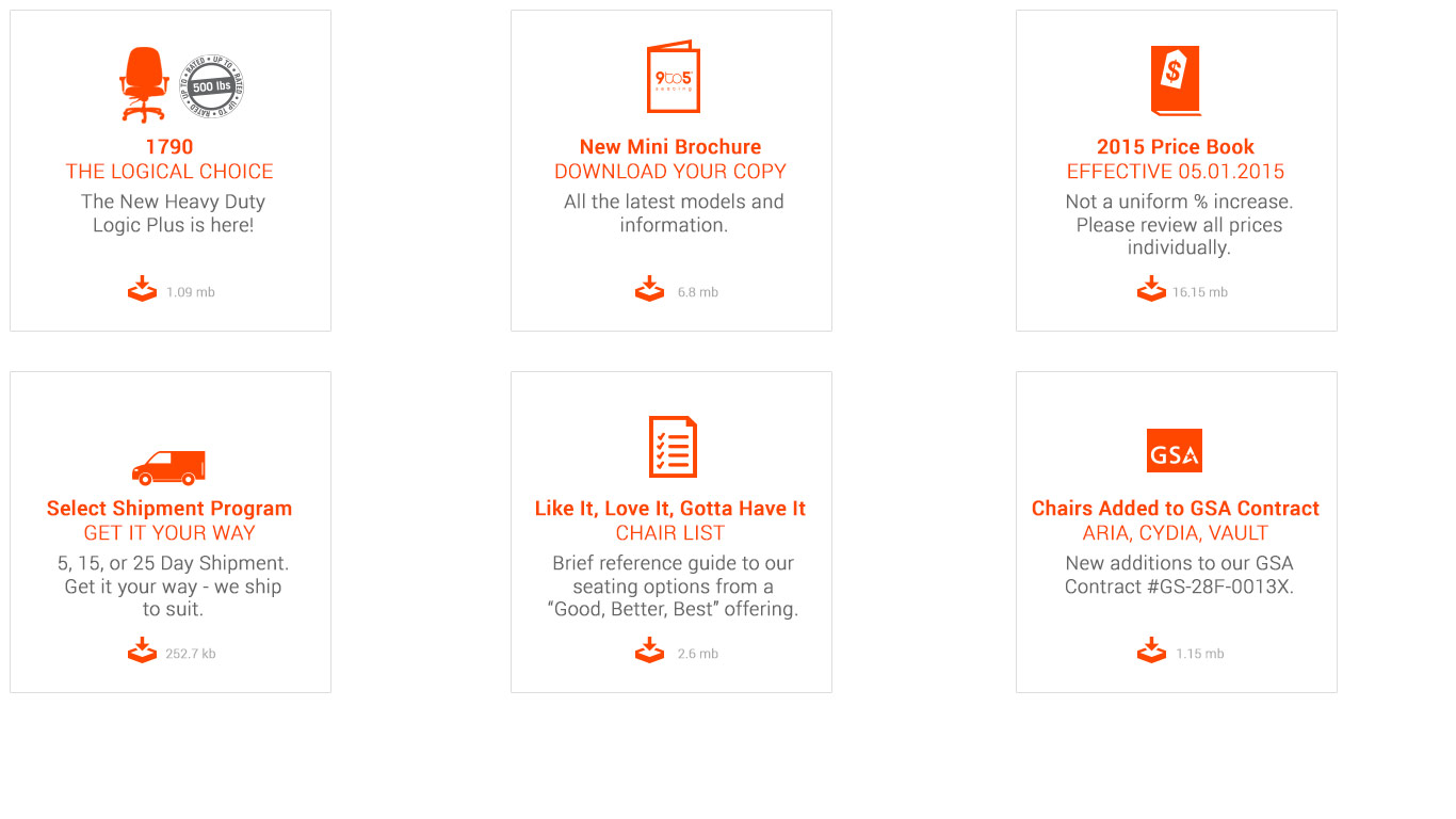
All Seating Function
One of the main attractions of the 9to5seating website, is of course the seating page. Each seat will be laid out by default in a three-column view but you will have the option to switch views in the layout options bar. Each seat will have its own hover menu/click menu (when on mobile) so that our users will get the most options available right there and then.
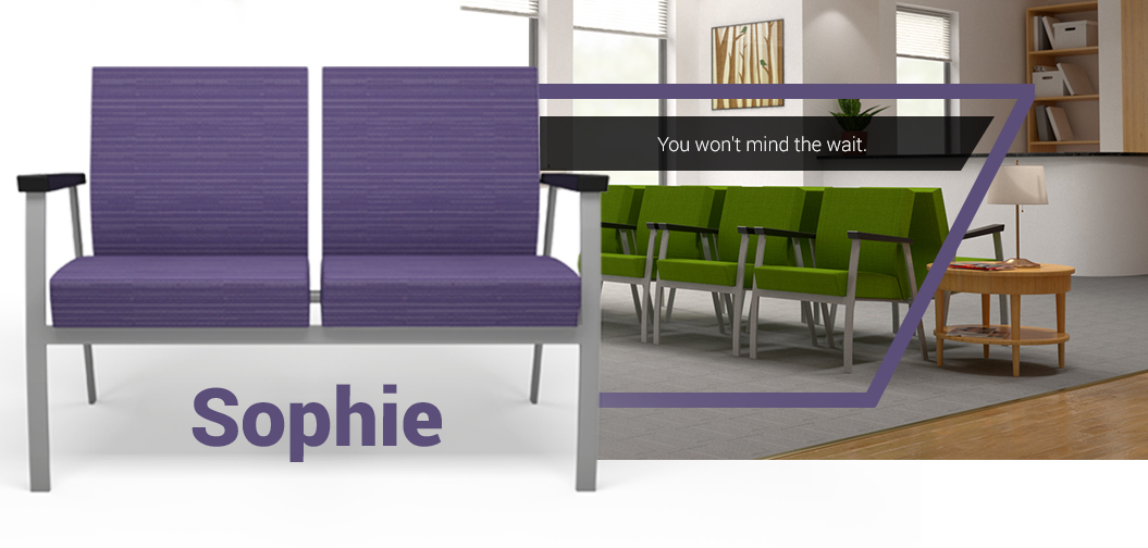
Seating Overview
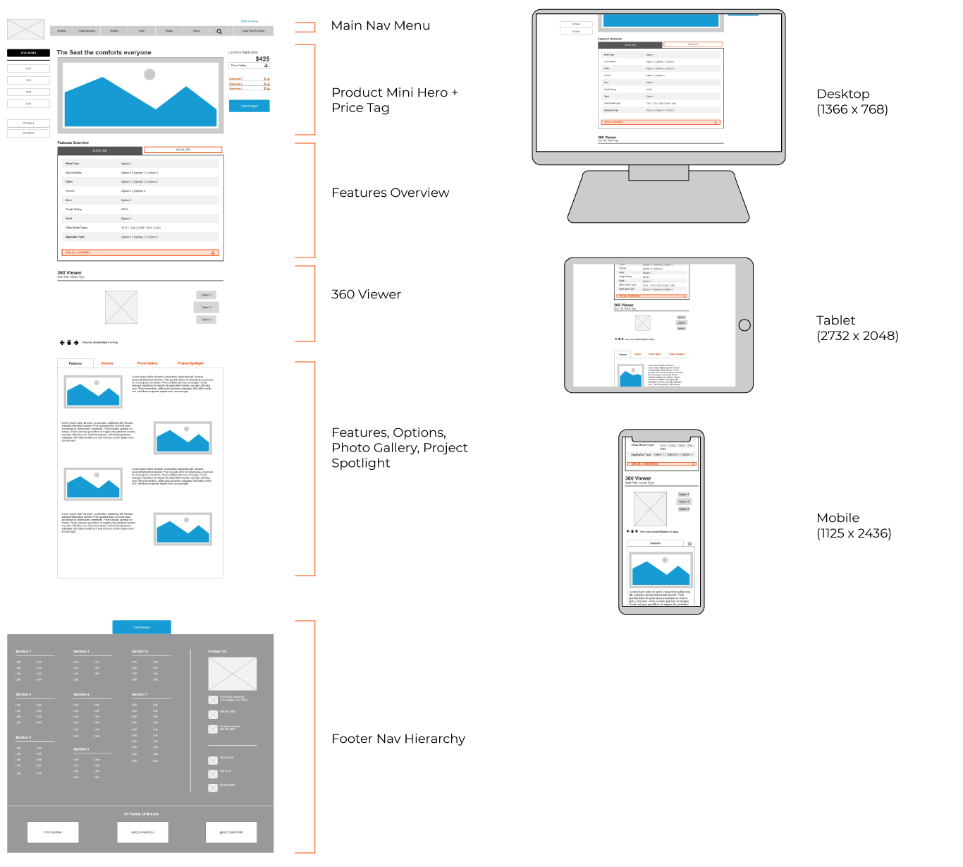
Mini Hero
For the seating overview we decided to move forward with the layout given above. The page will consist of a 3D rendering provided by our 3D Generalist, Jackie Adelmeyer, and display a lovely showcase of the specific product. The mini hero will give a welcoming vibe off to the clients and will display an environment of which the seat will best fit into.
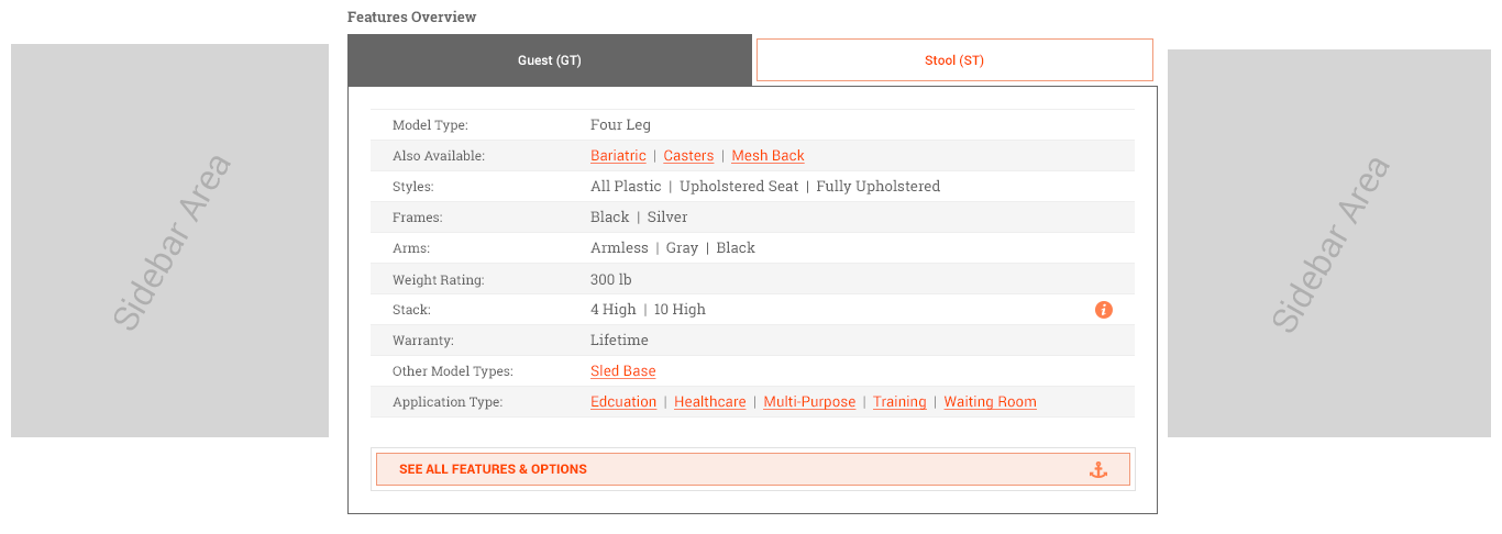
Features Overview
The idea behind giving a features overview is for instant specifications at a glance. This wouldn’t go over all the options in detail, but would give quick options to relate to the users needs. We had the idea that if the buyer can see that a seat comes with multiple options to fit their environment then it would push the user into seeing more or navigate more throughout the page to find what they’re looking for. This would be a great addition to the page.
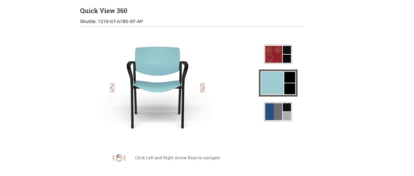
360 Viewer
Another feature we wanted to give our users was to view the chair at all angles around. So we implemented a 360 viewer used on all platforms as an easy way for our users to accomplish just that. The user would be able to choose from a few different seat colors and styles to help make a decision if that’s the direction they want to go in for their seating needs.
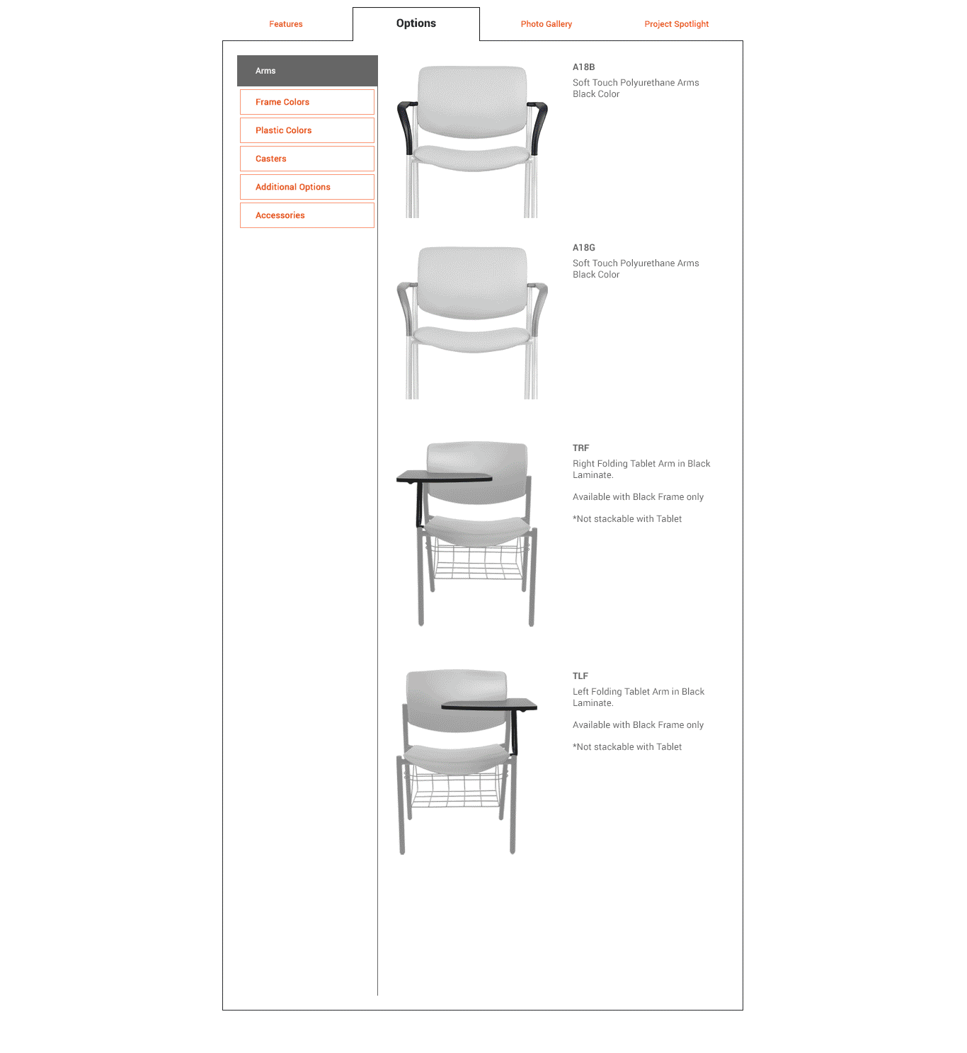
Features
So the final section for this page will consist of a tab feature module on the page that will give a more in-depth look at the features, options, spotlights (live environments), and Photo Gallery. Each tab will give a complete overview of the functions and options that each seat will contain. As the user dives into the options they will get a better idea of the full capabilities of each seat they view.

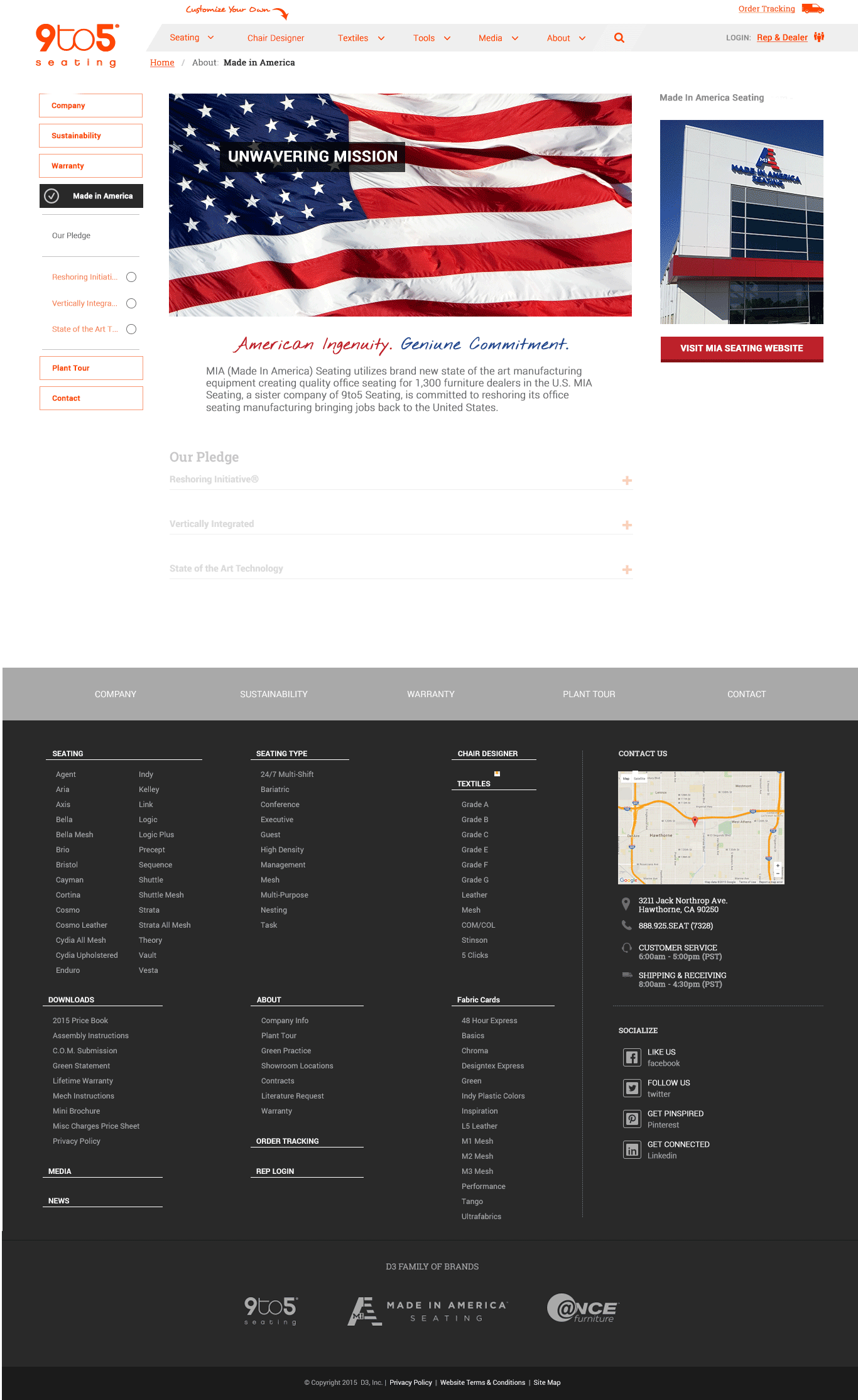
General Layouts
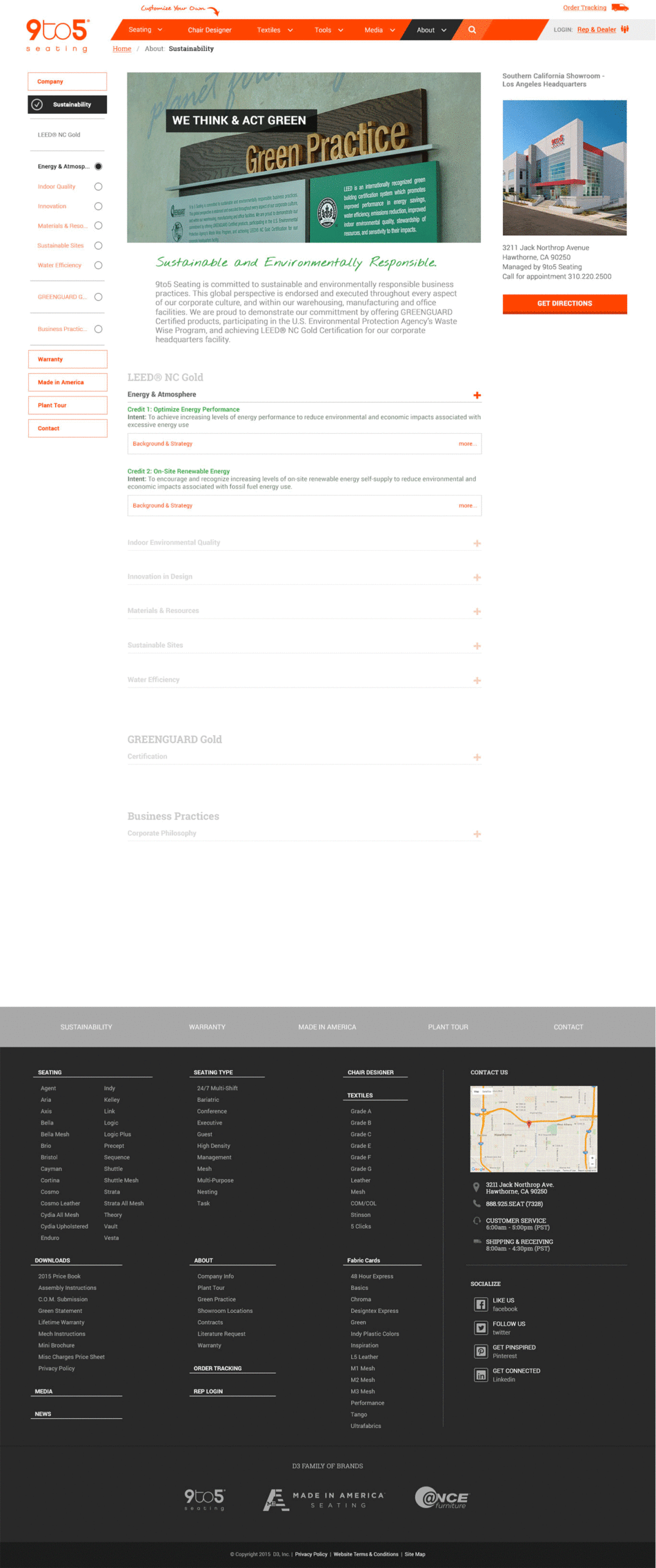
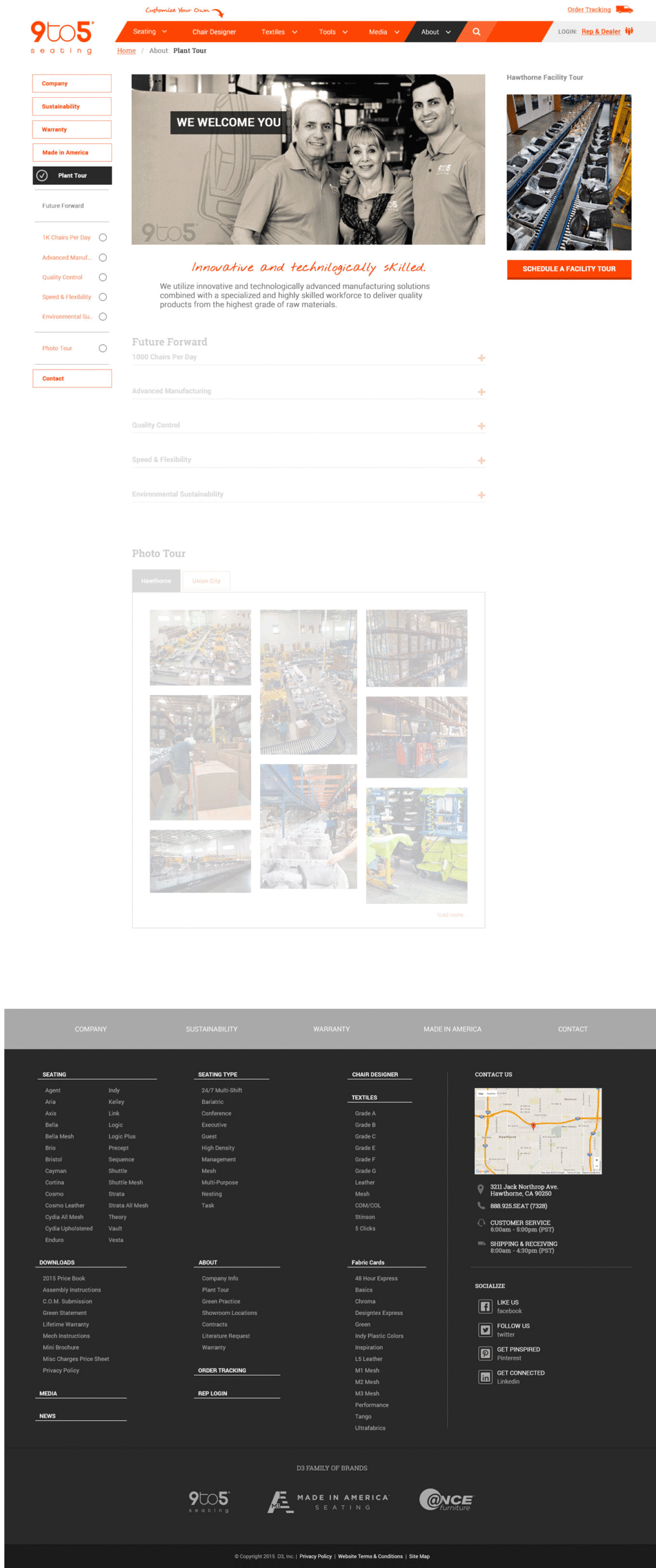
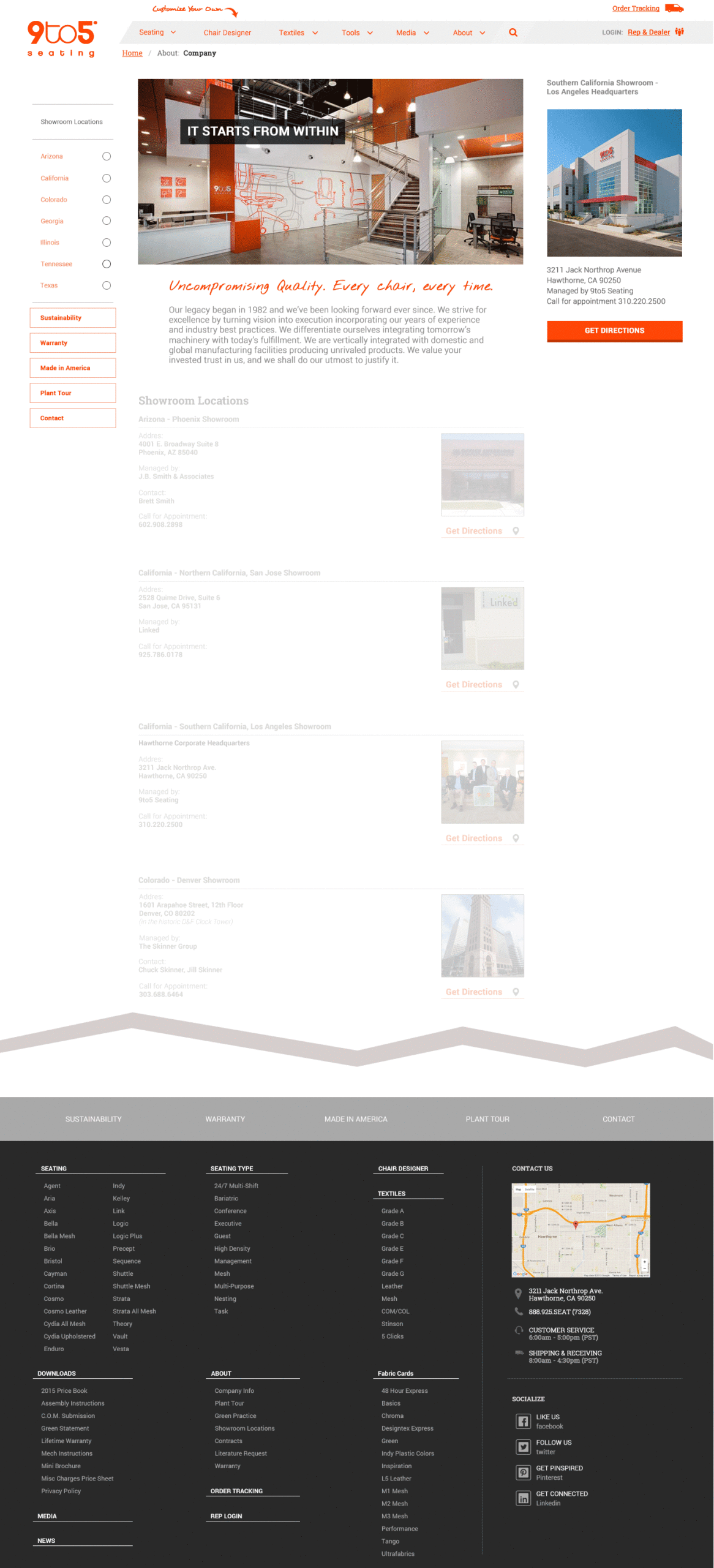
These layouts will display the default templates we would create for most internal pages. Unlike the unique pages above, these will generally display company information. So as we designed these page layout templates, we wanted to make sure that we stay consistent with how the layout felt from what we had on the Seating Overview. Since most users will navigate through the site, we thought it would be smart not to change the flow of the pages too much but make sure we had an intuitive layout when you seek new information. The sidebars also have consistency to them as they remain very similar across the site itself.
.
Development Hand off & Project Management
Our design phase was close to finish and with minor polishes and direction. This meant that we can now create a dev kit that contained developer notes along with navigation notes. Since we hired an outside agency to do most of the back-end development via WordPress we thought it was a good idea to give them a briefing. Good thing we prepared ourselves with a lot of site assets to show the new team and lead them into a successful project.

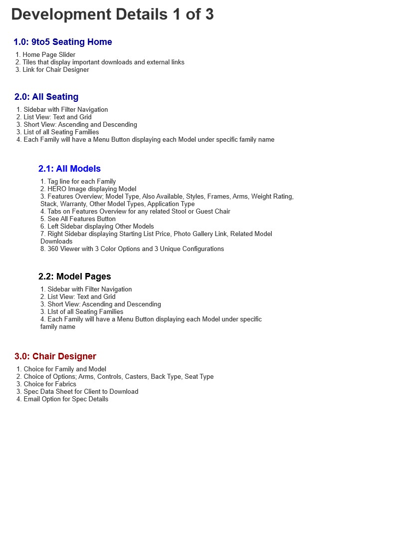
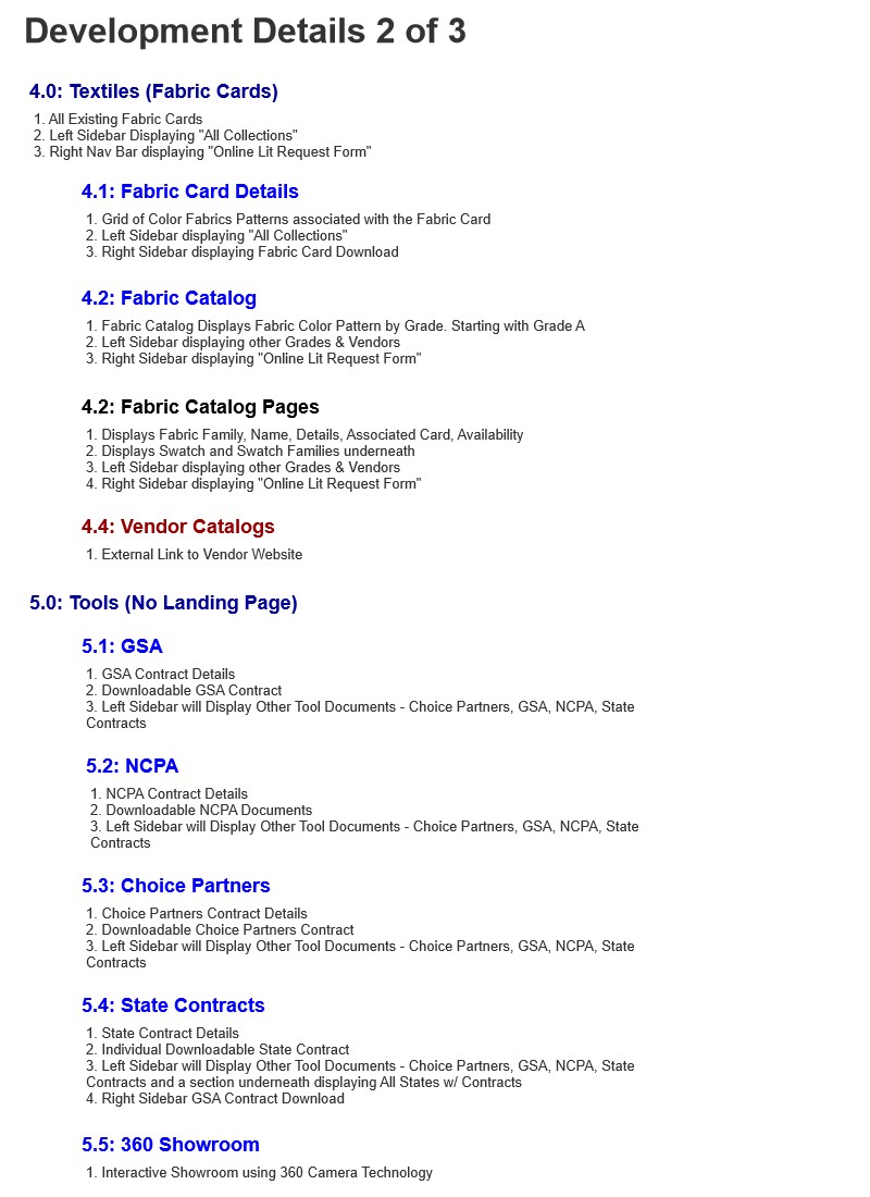
Developer Kit
We needed to create a system that allowed the dev team to work smoothly. A good habit I started to do is create a dev sheet that went along with the initial site-map. That way, the development team understood if certain pages required any special attention.
The initial site-map has a legend that consists of colors and special keys along with page number identities that would be used as a reference to the developer notes. The notes had individual developer points which would guide them accordingly.

Problem:
Although we had a lot of confidence in our development team we did have some obstacles. The development team had a hard time understanding some of the most current web technologies as bootstrap and also came into some road blocks building out the WordPress CMS system.
Solution Approach:
Our team had to come up with an effective way to help translate the design. On top of the mockups we’ve already completed we had to create more so that the team can fully understand. As most companies we had a contract to fulfill and couldn’t back out. So, we tried to make the best of it and tried to guide them as helpful as possible.
WordPress CMS
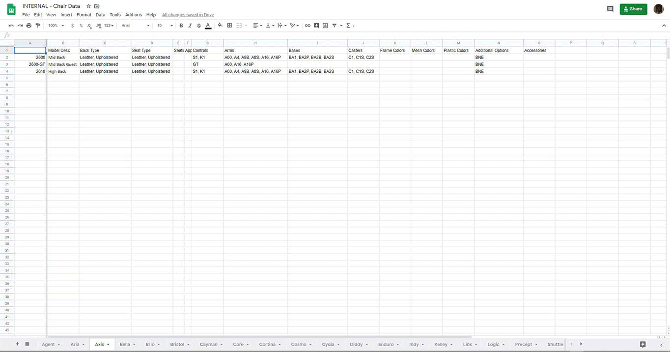
As mentioned previously the site would be based off of WordPress development. The Dev team had a difficult time understanding how to make the database come to life through WordPress. I took the time and mocked up an example of how the back-end should exist on the Content Management System side. We needed them to understand not only how the assets will show up on the side, but also how to get those assets on the site and saved to a database to auto populate into dynamic fields. The following mockup prototype was built for the team to get a good understanding of the labels we needed to add and how the fields were going to relate onto the product pages.
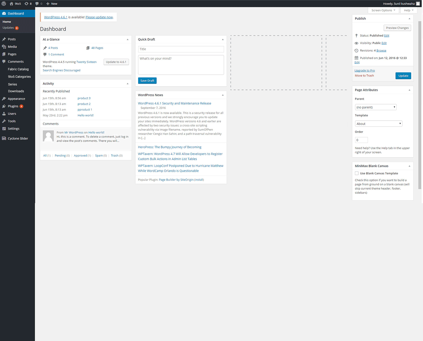
The mockup helped give the dev team a clear view of what needed to be done. Next step was to make sure they understood how the data worked and how it would translate onto the CMS. Mark Regynski and I had to fill out data tables via Excel/Google Doc Files to hand over to the dev team. The dev team would then appropriate the fields to the back-end of the CMS.
Conclusion
As all site assets have been handed over and we set examples to the development team of how the functionality of the site should be, Phase 1 of the new website was on it’s way. We still had minor bumps in the road but we worked together till the end result of the website. I’ve managed the team to the point where we got to test the site internally which most of our internal testers gave us the thumbs up! Phase One was now ready for launch!