User Interface × User Experience × WordPress
miVIP Surgery Centers: Phase II
Spring 2019, Phase 2 of the website was going into effect. The main miVIP website needed major updating and it was time for us to make our move before the new year. Our team made some adjustments for Phase 2 on the website but overall we were gunning for a new look and feel. I had help through HotJar to gather some statistics for the future look but ultimately the company wanted to move into that direction.

Problem:
The miVIP corporate website, wasn’t all bad, but was in desperate need of a makeover. We wanted to give the website a big modern facelift since it hadn’t been updated in quite some years. The other challenge we faced were issues with mixed style frameworks in the past which we wanted to start fresh and clean up as much code as possible.
Solution Approach:
The best approach we had was to start fresh as mentioned. We planned ahead and decided to stick with moving forward with a CMS using WordPress while implementing Bootstrap. One of our colleagues also built a custom content manager for our doctors so that the client can easily manage these items as they switch them out pretty often.
The Process
Since we’ve already been doing so much A/B Testing on the older version of the website, it made things a bit more clear in the direction of how we wanted to design the new website. As HotJar and Google Analytics being one of our best friends in this process, we took as much data from the two and applied it to the new design.

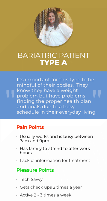
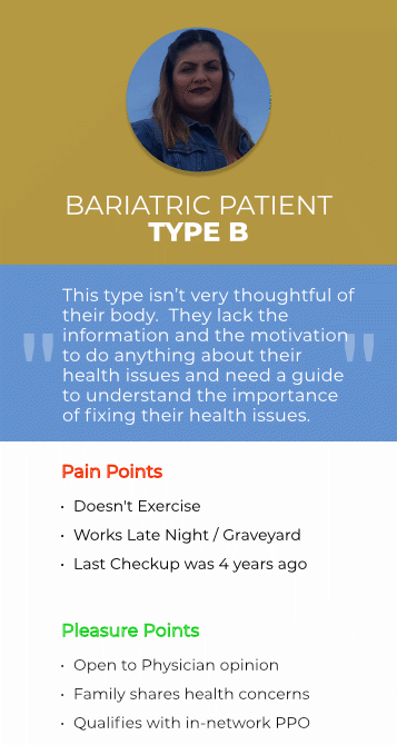
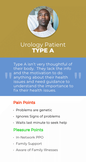
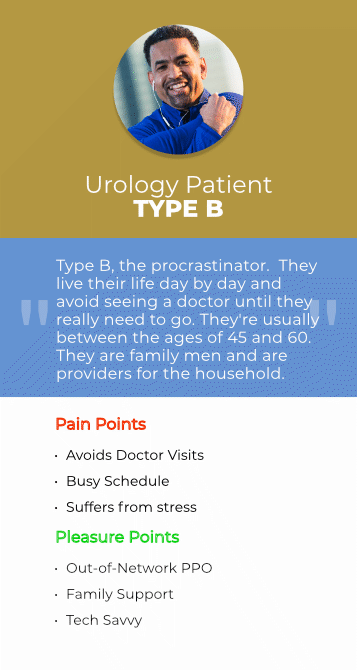
User Personas
Site Map
As we ran into issues into the pass with long scrolls we also needed to take into consideration how many scrolls the website was going to be as users only scrolled about half way through. So our Solution to that was to give enough information for each category while introducing a menu with all our different services.

UI Kit
Design Technology

Color Scheme

Typeface

Typography

Wireframes

Main Navigation
One of the biggest concerns we had was that we put together a navigation comfortable and easy for our clients and sales reps to navigate through. According to the hierarchy that we built, we wanted the most important features visible first, highlighting what our clients are initially coming and browsing on the site.
The navigation will consist of a hover state that will give a dropdown that will highlight each selected url button. For example if they are hovering over the seating category, we will give the a sub navigation with the option of Type, Category (Category for the purpose of the chair), and a spotlight of some of the recommended seats.

Just like the above the mobile version will also carry those different options but in a more compact design. The user will take some additional steps but they will still have full control of where they want to navigate.
Physician Bios
A problem miVIP had in the past was the functionality of how to find your physician. The old way was to scroll and try to find alphabetically. We wanted to make things easier to navigate so we came up with a solution to use three different ways to search at the tip of your fingers.
The first way is to look up by specialty. This will make things easier as you already know what type of treatment you’re needing. The second is by region/state. As there are only so many states miVIP services, you can really narrow down the area and the closest physician in your area. The third way is by searching the physician by last name with a last initial selector, which will give you all the surgeons listed under that initial.
Each section has a cap of how many will show and will be listed in a paginated alphabetical order.


General Layouts
These are a few different mockups that followed the foundation of our home page. Utilizing what we had in our thought process, we tried to keep a consistency in design layout, functionality, and the way you drive navigation and click on call-to-actions. Some pages more simple than others, didn’t need the overdrive of content on the pages but a way to get to the right page that you need or to the right content you’re looking for.
.

Development
For miVIP, the design process was pretty straight forward. Thankfully, we had some analytics pulled from HotJar and Google Analytics to help us with this process. With all our data, and collaboration ideas for the design, Studio 3 was hired to develop most of the front end. Along with our FullStack Developer, our developer handled most of the heavy lifting when it came to the backend data with our physicians and forms.

First Analysis


Conclusion

The start of Phase II was a successful launch. The journey will continue with constant A/B testing of the website and which what will work. As you can see from the first analytics things were a bit slow as the coming of Covid-19 approached the world, but as things pick up we’ll have a more clear indication of what will be the future of the look and marketing of miVIP Surgery Centers.